Salix Healthcare - Brand Identity & Website Design
Building a trusted, high-quality brand and website for a healthcare consultancy.
Skills
UX Design
Branding & Visual Identity
Logo Design
Tools
Figma
WordPress

Design Process
The project in short
For Salix Healthcare, a consultancy operating in the medical and health services sector, I was asked to create a high-end, clean and corporate visual identity that communicates trust, quality and professionalism.
The project began with developing a new logo. I explored several design directions, focusing on creating a mark that felt both contemporary and understated, something that could confidently represent a consultancy in a field where reliability and clarity are essential.
After refining the concept, I landed on a logo that balanced simplicity with a strong visual presence. The logo subtly references the international Star of Life, reflecting the brand’s connection to trusted healthcare standards.
With the logo established, I expanded the identity into a full brand system. This included defining a calm, minimal colour palette, typography choices that reinforced a sense of authority and precision, and a layout system designed for clarity and consistency.
I translated all of these elements into a structured style guide to ensure the brand could be applied cohesively across future materials.
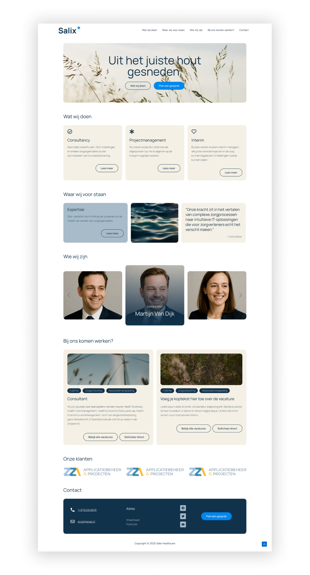
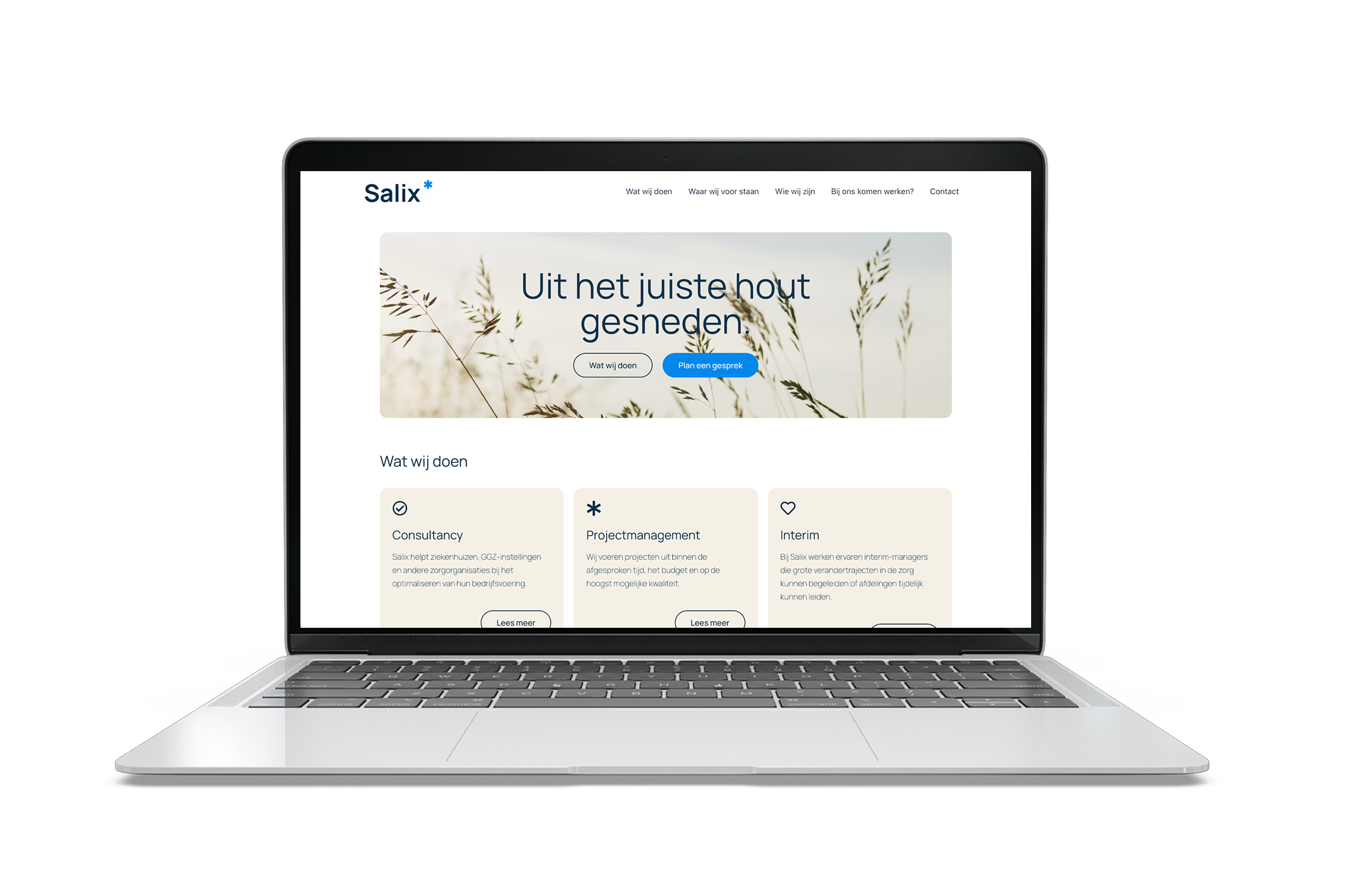
The final step was designing and developing the complete website in WordPress. My goal was to translate the brand identity into a seamless digital experience: clean lines, intuitive navigation and a layout that communicates expertise without overwhelming the user. The result is a modern, refined website that strengthens Salix Healthcare’s positioning in their industry.
The website is live and can be viewed on Salixhealthcare.nl.
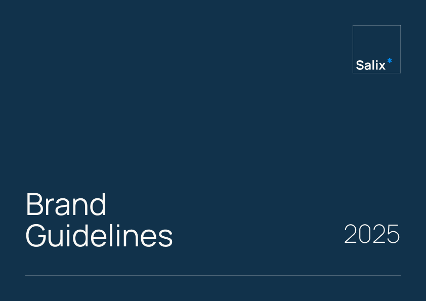
Brand Guidelines









Logo Design & Brand Colors

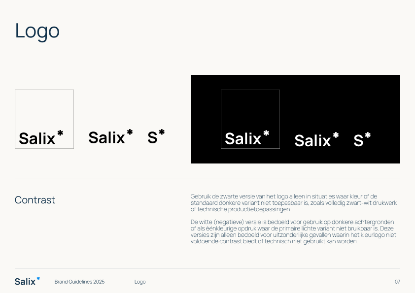
Logo Variations
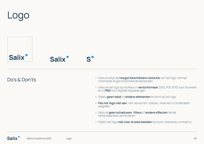
Full logo with frame: used for print materials, presentations, and other graphic applications where clear branding is needed.
Wordmark: ideal for digital use such as websites, email signatures, and documents where a more subtle, professional presence is preferred.
Compact version: designed for social media profiles, favicons, or any situation with limited space. This version remains recognizable and clear, even at small sizes.
Brand Colors
The colour palette balances trust, calmness and modernity. The primary deep blue was chosen to convey reliability and a high-end, corporate feel. Complementary sand tones and soft greys introduce a sense of calm and help emphasise white space throughout the brand. To add a contemporary edge, a vibrant blue accent is used sparingly as a highlight, ideal for calls to action and key interactive elements.

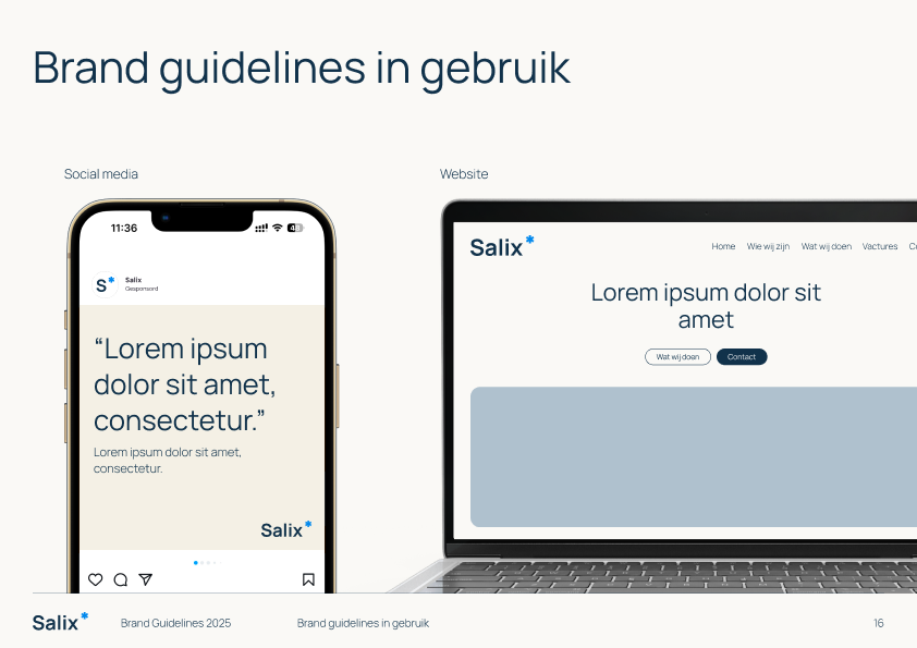
The Salix homepage
